/interface-design
A working interface whose tokens, states and layout follow from the product's job.
Then type /interface-design in Claude Code, or describe the task and let it pick the skill.
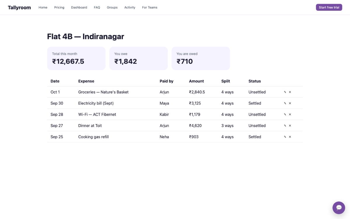
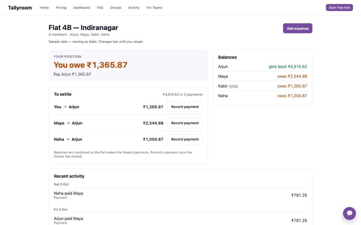
What you get back recorded run · 9 Oct 2026
- Fewest payments to settle up
- Undo instead of confirm steps
When to use it
Use when creating or redesigning pages, dashboards, workflows or components.
Skip it when only the words are wrong (ui-copy) or a finished page only breaks on phones (mobile-first).
The thinking behind itA good screen comes from the product's job, not a template. Design from the real content and every state, and people find what they came for.
Output contract from the skill's Output contract section
Deliver:
- implemented code or the explicitly requested design artifact;
- a short rationale connecting major decisions to product, content, and interaction evidence;
- the component/state coverage completed;
- assets, dependencies, or content requirements introduced;
- verification results at representative viewports and states;
- known gaps that still affect usability or fidelity.
If exploration was requested, provide genuinely distinct directions with tradeoffs and a recommended choice. Do not vary only palette and font.
How it checks its own work from the instructions
- Renders checked at desktop and narrow mobile widths
- Keyboard navigation, visible focus, and touch targets work
- Contrast, reduced motion, and zoom behavior are checked
- Placeholders and invented claims are removed
Requirements what it needs
- Works in
- Codex, Claude Code, Cursor
- Needs
- project files, terminal commands, browser access
The instructions SKILL.md · 130 lines
Instructions & references
Back to overview ↑On this page 12 sections
Interface design
Build a functional interface whose visual system, information architecture, states, and motion follow from the product's job. Preserve an effective existing system; do not replace it with a personal preset.
Establish the design problem
Recover available context before asking questions:
- product, audience, primary task, and success condition;
- route or component scope and implementation stack;
- existing design tokens, components, assets, typography, and brand rules;
- content shape, density, hierarchy, and likely extremes;
- supported viewports, input methods, themes, and accessibility requirements;
- required states, data dependencies, and destructive or irreversible actions.
Ask only for unresolved choices that materially change the result. When the user has not chosen a visual direction, propose one or more reasoned directions from the product evidence and proceed with the most defensible option unless the choice is consequential or costly to reverse.
Choose the working mode
- Extend — reuse and improve an established system.
- Redesign — preserve product semantics while changing structure or visual language.
- Greenfield — create a small system from content and task requirements.
- Explore — present distinct directions or a design specification before implementation when the brief is intentionally open.
Do not erase existing brand decisions merely because common defaults are present. Do not preserve them merely because they exist; evaluate whether they support the task.
Model the interface job
Adapt the composition to the surface:
- Marketing — make proposition, product evidence, proof, and next action easy to evaluate.
- Dashboard — prioritize current state, frequent tasks, comparison, scanning, and useful density.
- Form or workflow — clarify sequence, requirements, validation, recovery, and completion.
- Settings — expose state and consequence; separate routine changes from dangerous actions.
- Data table or analysis — support sorting, filtering, comparison, selection, empty results, and overflow.
- Documentation — support orientation, navigation, readable examples, and long-form rhythm.
- Consumer experience — fit touch, attention, trust, and emotional tone to the actual context.
These are starting concerns, not layout templates. Let the content determine grouping and component anatomy.
Build the system
Define or extend tokens only after deciding what roles the interface needs:
- surface and text hierarchy;
- semantic colors for action, information, success, warning, and danger;
- typography roles suited to language, density, and brand;
- spacing, measure, grid, and responsive behavior;
- radii, borders, shadows, and elevation with explicit component roles;
- motion durations and easing tied to state change or spatial continuity;
- focus, disabled, selected, loading, and error treatments.
Use the existing token format when one exists. For a greenfield system, keep the token set small enough to explain and broad enough to avoid one-off values. Common fonts, colors, or components are acceptable when they fit; novelty is not a goal.
Component contracts
For each material component, specify:
- semantic purpose and content model;
- variants that represent real roles rather than cosmetic permutations;
- interactive states and keyboard behavior;
- responsive and overflow behavior;
- accessible name, relationship, status, and focus behavior;
- loading, empty, error, success, and permission states when relevant.
Do not force unrelated content into one card schema. Use whitespace, typography, alignment, borders, surfaces, or containment according to the relationship being expressed.
Design the content and states together
Use real repository content or clearly marked representative fixtures. Test the shortest, longest, empty, loading, error, populated, disabled, permission-limited, and destructive states that the workflow can reach.
Keep interface copy consistent with the product's existing terminology and voice. Name consequential actions and objects. Preserve calibrated uncertainty and domain language. Do not force lowercase labels, fragments, casual voice, benefit-first marketing, author credits, or punctuation bans onto the product.
Never invent proof, customer data, operational status, or chart values to make a composition look complete. Use labelled fixture data for development and keep it out of claims.
Use assets intentionally
Prefer first-party assets and product evidence. Inspect licenses and repository conventions before adding third-party icons, fonts, or images. Do not fetch personal avatars, favicons, logos, or remote imagery solely to fill space.
When an asset is unavailable, design a truthful fallback or identify the missing-content requirement in the handoff.
Add motion only when it helps
Use motion to explain state change, preserve spatial context, acknowledge input, or direct attention. Match amplitude and duration to the consequence and frequency of the interaction.
- Routine controls should respond promptly and predictably.
- Entrances should not delay access to content.
- Repeated list and scroll animations should remain calm at scale.
- Loading motion must correspond to real system state.
- Support
prefers-reduced-motionwithout hiding information or completion feedback.
Do not require a motion library when CSS or the existing stack already handles the behavior.
Implement within the codebase
Follow the project's component, styling, routing, data, and testing conventions. Reuse sound primitives before introducing new dependencies. Keep data and interaction behavior functional; a production implementation is not a static mockup unless the user explicitly asked for one.
For large scopes, implement a coherent vertical slice or agree on a staged sequence. State what is complete rather than implying an entire product was built.
Output contract
Deliver:
- implemented code or the explicitly requested design artifact;
- a short rationale connecting major decisions to product, content, and interaction evidence;
- the component/state coverage completed;
- assets, dependencies, or content requirements introduced;
- verification results at representative viewports and states;
- known gaps that still affect usability or fidelity.
If exploration was requested, provide genuinely distinct directions with tradeoffs and a recommended choice. Do not vary only palette and font.
Verify
- Run relevant build, typecheck, lint, and tests.
- Render representative desktop, tablet when relevant, and narrow mobile widths.
- Exercise keyboard navigation, visible focus, pointer and touch targets, dialogs, menus, and destructive actions.
- Check headings, landmarks, labels, descriptions, live status, contrast, reduced motion, and zoom behavior.
- Test real content extremes and every meaningful state; inspect clipping, wrapping, scrolling, and sticky behavior.
- Confirm the primary task remains discoverable and completable without relying on decoration or motion.
- Compare the result with existing brand and component evidence; explain intentional departures.
- Remove placeholders, invented claims, unused components, and style rules that have no role.
- Report what was directly verified and what could not be exercised in the current environment.
Claude app, ChatGPT and ZIP download
local coding agent required
This skill requires project files, terminal commands, and browser access. Uploading it to a chat app does not provide equivalent execution.
ChatGPT Skills
This workflow needs a local coding environment or capabilities that a chat-only Skills upload does not provide.
Package details
- Package
- interface-design/SKILL.md
- Author
- @tushaarmehtaa
- Added
- 22 Jun 2026
- Tags